For 6 years I've taken a lead role as head of brand, leading the marketing efforts at a Richmond, Virginia-based startup called TemperPack. TemperPack designs and manufactures sustainable alternatives to plastic insulation for the perishable shipping market - basically an environmentally friendly Styrofoam. In my role, I brought the company though an entire rebrand, giving it a look and feel that allowed it to compete with companies 10x their size. In my time at TemperPack we’ve grown from a scrappy startup of 12 people to over 750 and have raised over $200M in seed round fundraising.
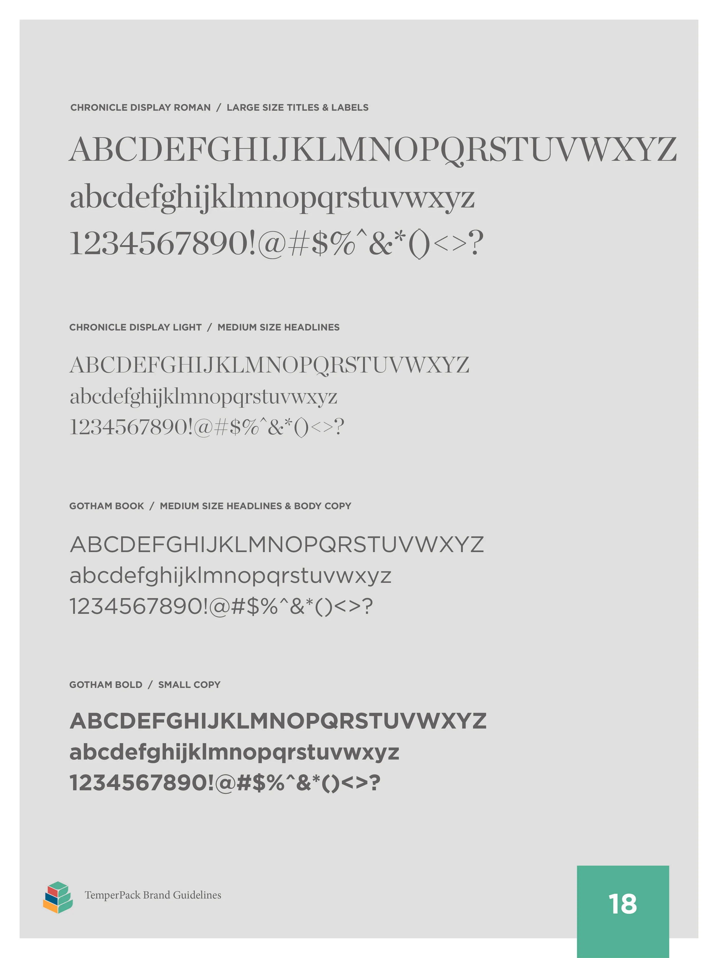
I began the rebranding process with a visual redesign, choosing fonts, colors, and forms that gave the company a friendly, yet authoritative appearance.
Logo V.2
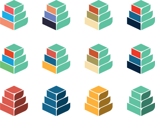
The logo design went through many iterations before landing on the current mark. The new logomark is an evolution of the original TemperPack mark - a leaf and box combined. We’ve added complexity to the mark while still retaining the brand’s focus on packaging and sustainability.
I explored countless iterations of the abstract mark before landing on the current one.
I iterated on the wordmark, changing various elements of its Gotham-based foundation until we found a balance that complimented the abstract mark.
Additionally, we looked at how color would affect the abstract mark, eventually landing on a scheme that played up the friendly, youthful vibe that the company exhibits.
After solidifying the look and feel, I developed a larger brand toolkit that included branding for the industries we serve, the materials we use, and the products we make.
By expanding the color palette, we were able to dedicate colors to industries. Proving Ground is TemperPack's R&D lab brand, where new products are created and tested.
TemperPack utilizes three main materials for its insulating products.
With so many product SKUs using different materials, TemperPack needed a standardized product labeling approach. The rounded square mark denotes the form factor as well as the material utilized.
TemperPack Brand Guidelines
All of the information was codified into a brand guidelines document and distributed to the entire company.
Sales Collateral
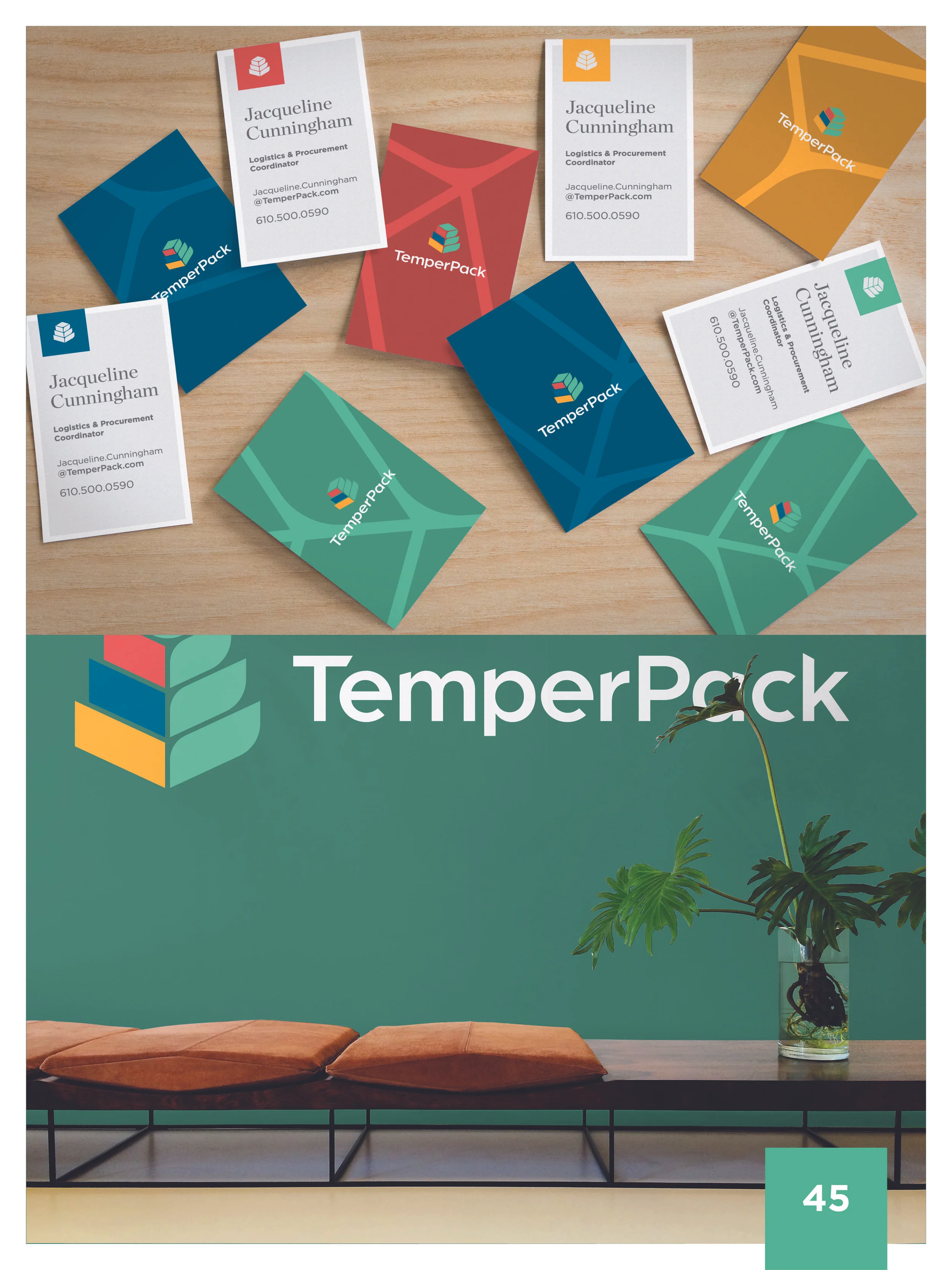
I then took the standards we developed and built out a tool-kit that our sales team could use to impress potential clients and close deals.
Video
We’ve also developed a lot of high quality video content to give our audiences a better idea of who we are, what we stand for, and what we make.
Product Photography
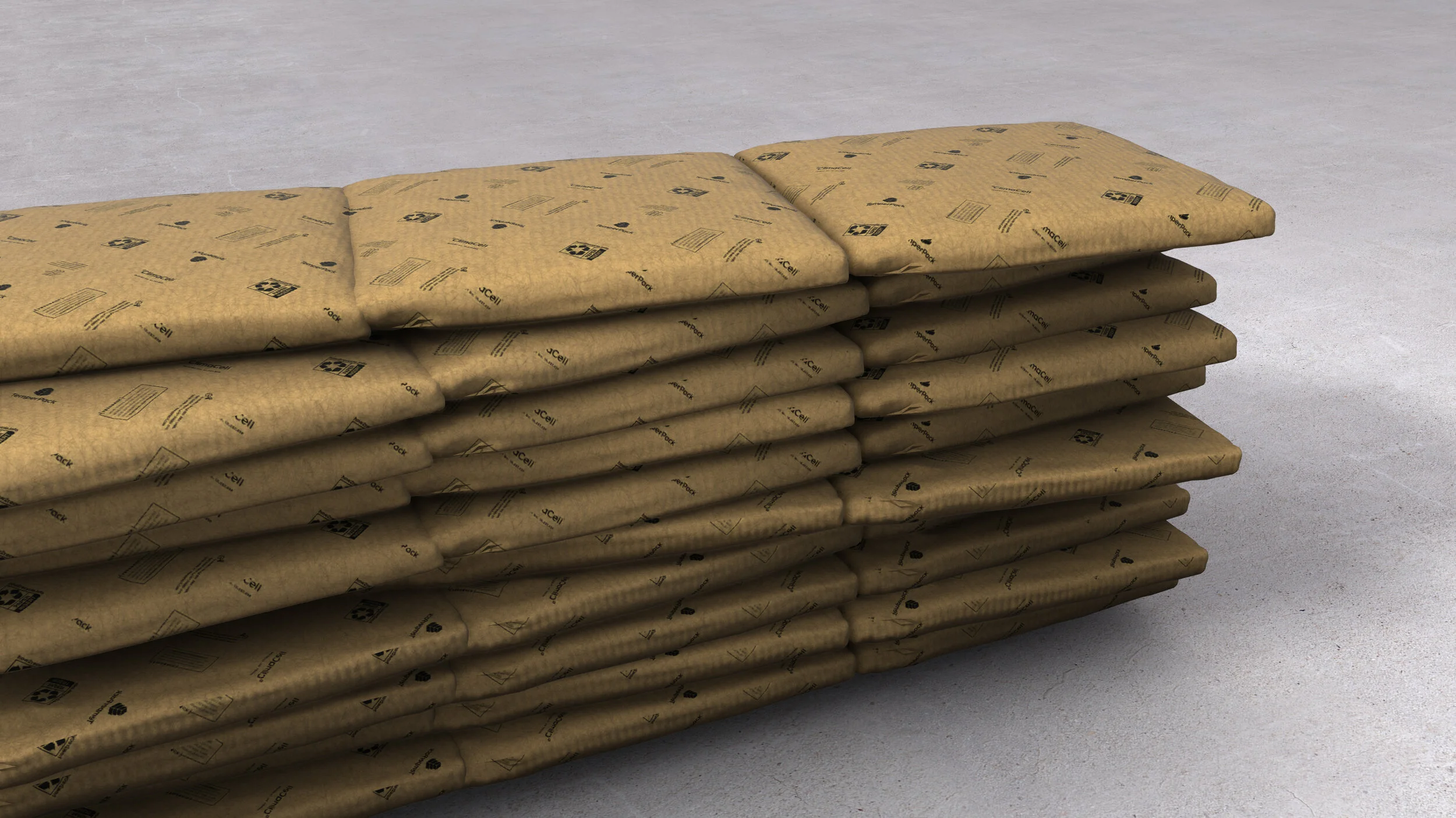
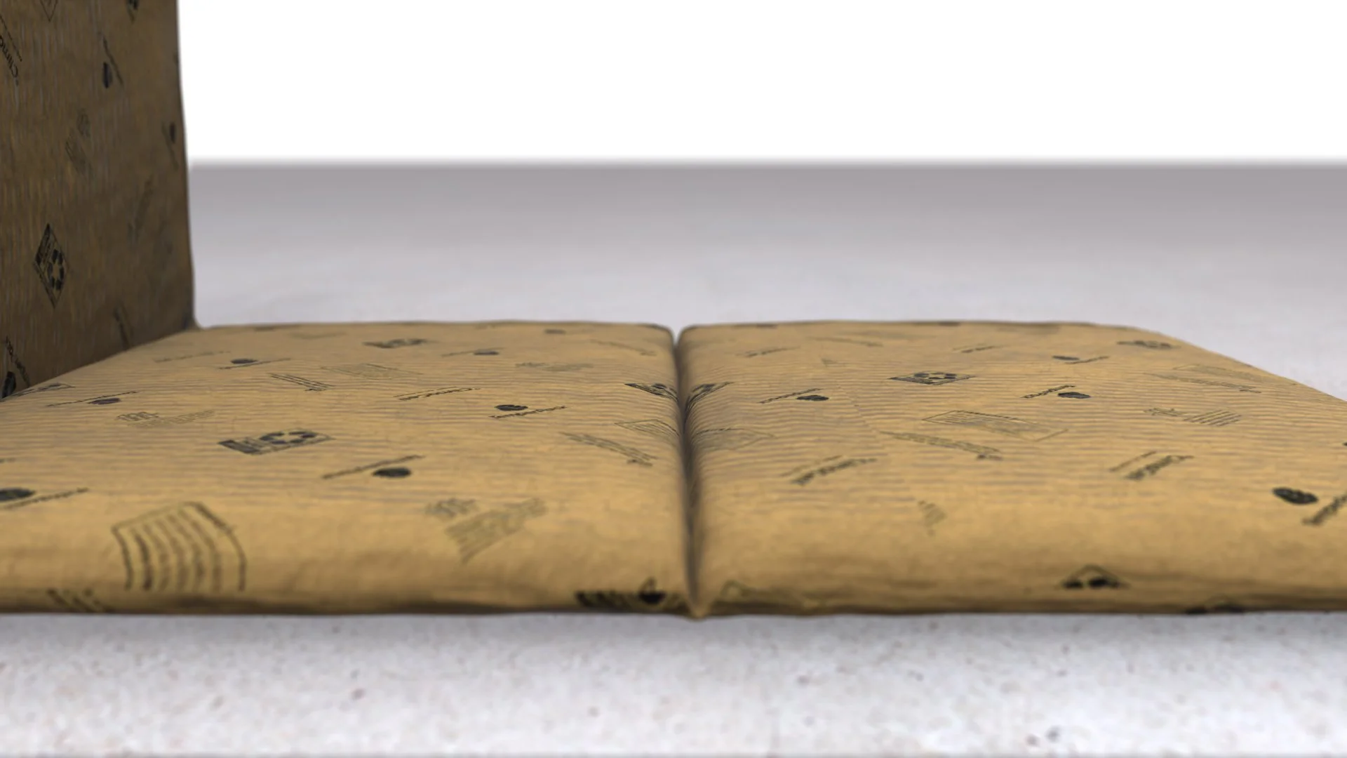
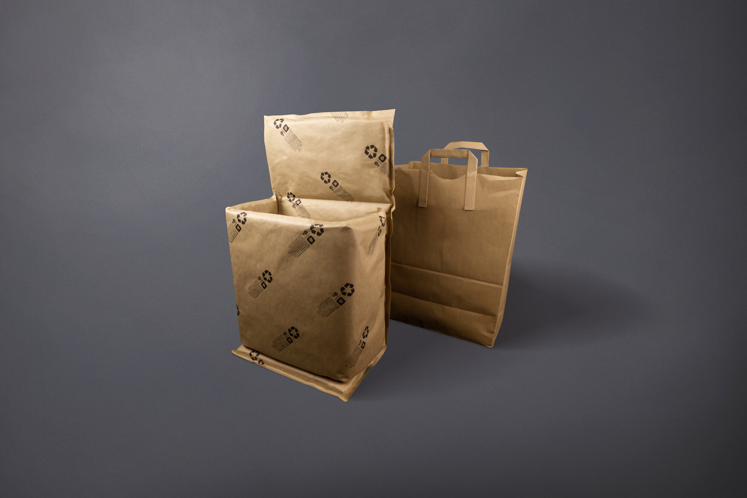
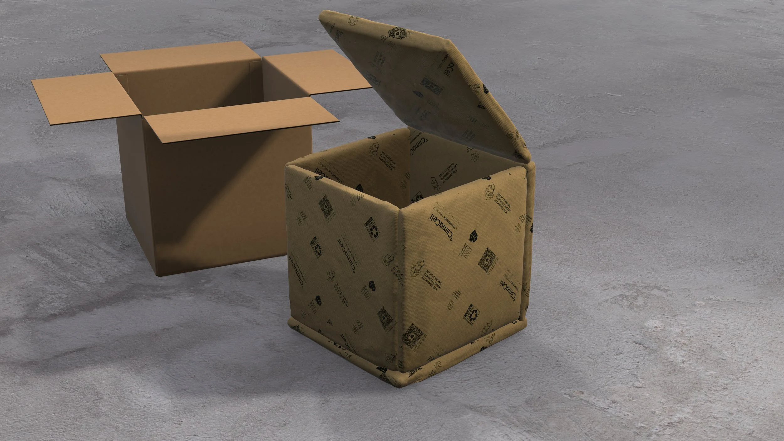
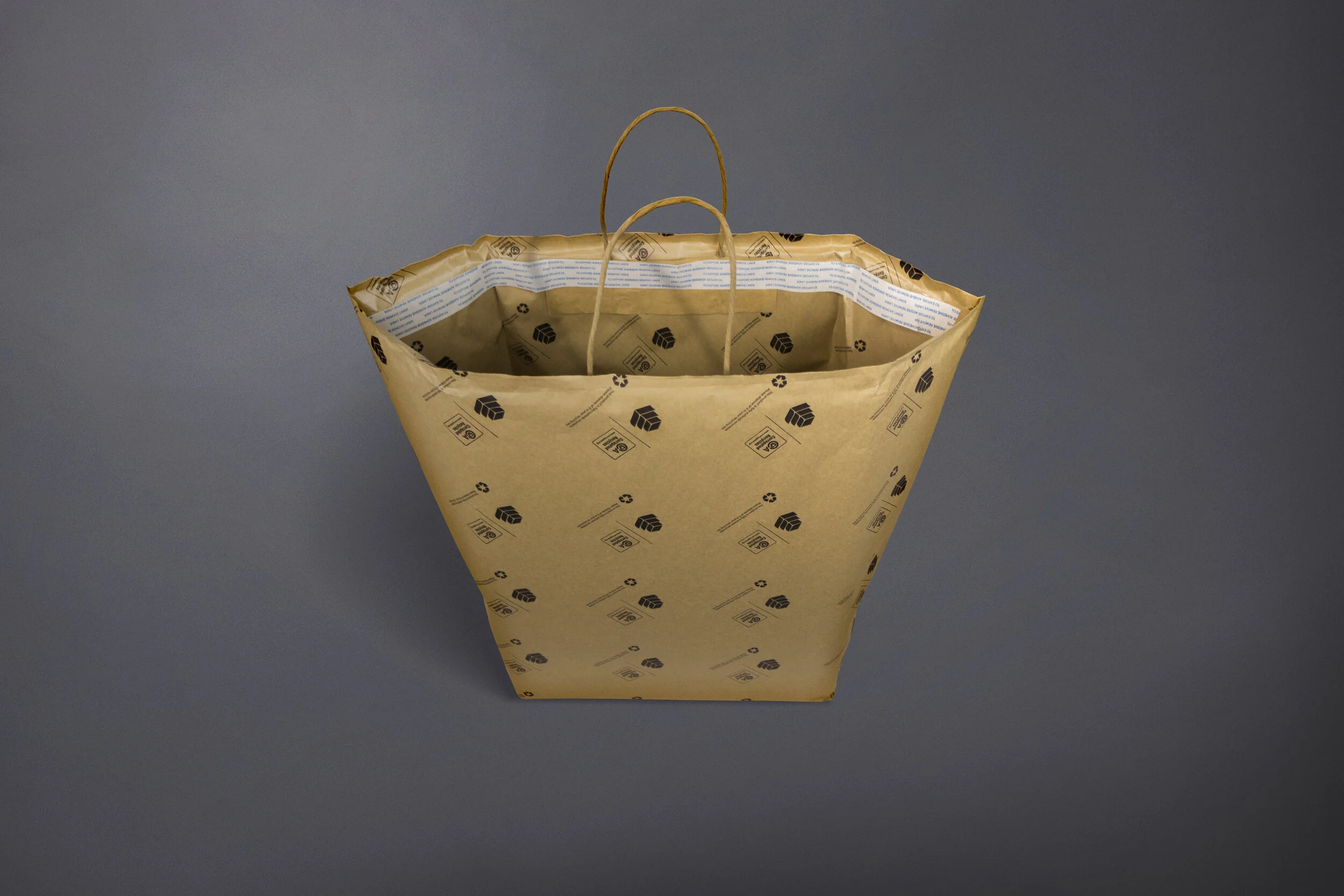
As a scrappy start-up, all production, editing and photoshoots were done in-house, which basically means I took a ton of photos of boxes. I was responsible for all of the product photography, which included shooting and retouching every product photo. In order to unify our look, I photographed products, then edited them all on a uniform background. As our product became more uniform and refined, I moved our image production almost completely to 3D models, allowing us to showcase specific features and place products in situ on the fly.
Website
In addition to developing all of the physical materials and PDFs used for sales, I also design, develop and manage the company’s website. My goal with our site is not to trap users in endless loops, but to actively engage them, inform them of our offerings through stunning visuals, and give them easy opportunities to get in touch.
Office Space
I also designed all of the office space for the company, infusing the space with our branding.
